Tag Archives: analytics

Setting Up Google Analytics alternative Plausible.io on Amazon Lightsail

With the imminent demise of Google Analytics Universal in July 2023 I’ve been searching for an alternative and found an Open Source project from Plausible.io. Slight warning, this post is largely for myself to remember what I did to get this going so YMMV.

I host a few sites on Amazon Lightsail and while I found a few great posts discussing self-hosting of Plausible I found these setups perhaps a bit more complicated that I think it needed to be. For example, Lightsail has instances that include both a web server and Bitnami’s Let’s Encrypt SSL tool already installed so starting from an OS-only instance type requires some unnecessary configuration.

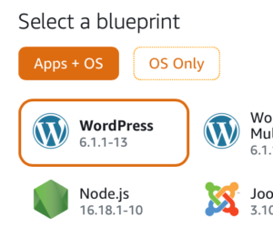
To get started quickly browse to the Amazon Lightsail console and under Apps + OS select the NodeJS instance using Debian (as of this writing Feb 2023). You could use and “OS Only” option but then you’d be left installing a number of packages vs. using this pre-built instance.

Amazon Lightsail instance selection

You’ll want to setup a static IP address for this instance for your DNS entry (see below). Next, SSH into your instance and create an “apps” folder under /opt/bitnami:

$ cd /opt/bitnami
$ sudo mkdir apps
$ cd apps

Clone the Plausible repo and setup the configuration as per the great Plausible self-hosting guide:

$ sudo git clone https://github.com/plausible/hosting plausible
$ cd plausible
# Generate SECRET_KEY_BASE value using openssl
$ openssl rand 64 | base64 -w 0 ; echo
$ sudo vi plausible-conf.env
# Edit the plausible config file and add config values

Install a missing gpg package:

$ sudo apt update -y
$ sudo apt-get install gpg
$ sudo curl -fsSL https://download.docker.com/linux/ubuntu/gpg | sudo gpg --dearmor -o /usr/share/keyrings/docker-archive-keyring.gpg
$ echo "deb [arch=amd64 signed-by=/usr/share/keyrings/docker-archive-keyring.gpg] https://download.docker.com/linux/ubuntu focal stable" | sudo tee /etc/apt/sources.list.d/docker.list > /dev/null
$ sudo apt-get update
$ sudo apt-get install docker-ce docker-ce-cli docker-compose containerd.io -y

There are only a few config values you need to launch your instance and start tracking your site’s analytics:

ADMIN_USER_EMAIL=
ADMIN_USER_NAME=
ADMIN_USER_PWD=
BASE_URL=
SECRET_KEY_BASE=

NOTE: I added DISABLE_REGISTRATION as I’m the only user who needs access.

I use Cloudflare for my CDN/DNS and I created an A NAME DNS-only entry pointing to analytics.<domain>.com which I use for Plausible.

Next, again following the self-hosting guide I started up the server using docker-compose:

$ sudo docker-compose up -d

The docs weren’t super clear about getting the first user created but browse to your URL and register the first user directly on the site. Following that I would recommend disabling registrations in the plausible-conf.env using:

DISABLE_REGISTRATION=true

Next, run Bitnami’s bncert-tool and setup a Let’s Encrypt SSL cert for your server once you’ve made a donation.

Finally, setup your Apache virtual host config by copying the existing sample HTTPS configuration:

$ cd /opt/bitnami/apache/conf/vhosts
$ sudo cp sample-https-vhost.conf.disabled plausible-https-vhost.conf

Here’s my Apache vhost file for Plausible (using X-Robots-Tag to prevent crawling):

<VirtualHost 127.0.0.1:443 _default_:443>
  ServerName analytics.<domain>.com
  ServerAlias *
  SSLEngine on
  Header Set X-Robots-Tag "noindex, noarchive, nosnippet"
  SSLCertificateFile "/opt/bitnami/apache/conf/analytics.<domain>.com.crt"
  SSLCertificateKeyFile "/opt/bitnami/apache/conf/analytics.<domain>.com.key"
  DocumentRoot /opt/bitnami/apps/plausible
  # BEGIN: Configuration for letsencrypt
  Include "/opt/bitnami/apps/letsencrypt/conf/httpd-prefix.conf"
  # END: Configuration for letsencrypt
  # BEGIN: Support domain renewal when using mod_proxy without Location
  <IfModule mod_proxy.c>
    ProxyPass /.well-known !
  </IfModule>
  # END: Support domain renewal when using mod_proxy without Location
  <Directory "/opt/bitnami/apps/plausible">
    Options -Indexes +FollowSymLinks -MultiViews
    AllowOverride All
    Require all granted
  </Directory>
  ProxyPass / http://localhost:8000/
  ProxyPassReverse / http://localhost:8000/
  # BEGIN: Support domain renewal when using mod_proxy within Location
  <Location /.well-known>
    <IfModule mod_proxy.c>
      ProxyPass !
    </IfModule>
  </Location>
  # END: Support domain renewal when using mod_proxy within Location
</VirtualHost>

Following this suggestion, in /opt/bitnami/apps/plausible I created a robots.txt file with the following. Note, need to allow /js/ to allow crawling to work correctly for pages using Plausible:

User-agent: *
Allow: /js/
Disallow: /

I then updated the docker-compose.yaml adding a volumes mapping to this local file under the plausible service.

Lastly, restarted both Plausible and Apache and you should be well on your way to getting your Google Analytics alternative running.

$ sudo docker-compose down --remove-orphans && sudo docker-compose up -d
$ sudo /opt/bitnami/ctlscript.sh restart apache

All in all, the above took me less than a hour to get a working instance of Plausible.io up and running, self-hosted for $20/month on a 4GB Lightsail instance.

So far, I’ve been running this instance for 6 days and it looks pretty good. I’m getting a 500 error trying to import my old GA data so not quite sure what’s going on there but I did manage to get Google Search Console enabled but I’m not see where that data might show up. I’ve also setup email reporting and I’m curious to see what those look like.

Lastly, this project lives on its paid subscriptions to its cloud hosted version and assuming it works out I’ll be sure to use their sponsorship page.

Using Google Sheets, Pivot Tables and Charts as a Startup Dashboard – Part II

In my previous post I wrote about the process that lead me to build a dashboard but first I want to talk a bit about the structure of the data in the Google Sheet where the whole process started. I first started by looking to quickly create a few charts to visualize some of our KPI‘s. To source the data I created a text file containing the SQL statements and used psql to fetch Postgres data which I dumped it to data into .CSV files for import into separate “data” only tabs in Google Sheets.

psql -h pgserver -d mydb -U myuser -w -t -A -F $ '\t' -f ~/Campains.sql > campaign.csv

The first tab was the “primary” dataset which contained a wide (A to AX) set of columns with a blend of content from the various linked “data” tabs and is where I derived all of the pivot tables with a primary key in the first column and with this initial set of at I was able to start building charts to help visualize the data.

Of course, once you’ve answered one question it leads to follow-on questions which require more data leading to more questions. Before long I was querying a dozen tables from Postgres and MSSQL and importing the data into these “data” tabs. For data tabs with a 1-1 relationship based on primary key I would aggregate the data onto the main sheet with a formula like “Imported Data’!B4” or in cases where not all keys were present via a lookup like =IFERROR(VLOOKUP($A:$A,”Data Sheet”!$A:$E,3,FALSE),0) setting the result accordingly when the primary key wasn’t found.

Ultimately, flattening the data made it easy to construct pivot tables for aggregate totals, averages, counts, and median values etc. from which I could build a variety of charts a sampling of which I’ve included below.Here’s a small sample of the kinds of charts built from pivot tables. Yes, I’ve clipped/changed some of the legends knowingly obscuring the underlying meaning of the chart.

Here’s a small sample of the kinds of charts built from pivot tables. Yes, I’ve clipped/changed some of the legends knowingly obscuring the underlying meaning of the chart.

Monthly Totals

I built a variety of pivot tables for the Wanderful Marketing team (sans charts) for easy analysis of Cash Dash campaigns from a variety of angles such as by a given retailer by offer type, amount, reward, launch day of the week and a variety of campaign performance metrics that I’d calculated within the sheet. Ultimately, the usefulness of this data caught on and a number of teams were not only reviewing the data but asking for additional analysis and updates.

While I was able to automate some portions of updating this sheet, its associated tabs etc. Google Sheet’s charts and pivot tables don’t automatically expand as the size of your data grows which made it a laborious task to “re-scope” them as more data was added not to mention I knew the 2M cell limit was looming in the distance.

In a follow-on post I’ll talk about how I began the shift to automating this using R and a Shiny Dashboard running on an OSX Mac mini.

Plotting Weekly Mobile Retention from the Localytics API using R and ggplot2

Part of building mobile web apps is understanding the myriad of mobile analytics and in part visualizing the data to shed light on trends that my otherwise be difficult to see in tabular data or even a colorful cohort table. I’ve been building a dashboard using R, RStudio, Shiny, and Shiny Dashboards aggregating data from MSSQL, Postgres, Google Analytics, and Localytics.

Within the Product section of the dashboard I’ve included a retention chart and found some great articles at R-Blogger like this one. The retention data comes from the Localytics API which I discussed previously though getting the data into the proper format took a few steps. Let’s start with the data, here’s an example of the REST response from Localytics looks like for a weekly retention cohort:

{
"results": [
{
"birth_week": "2014-09-08",
"users": 1,
"week": "2014-12-29"
},
{
"birth_week": "2014-09-29",
"users": 1640,
"week": "2014-12-29"
},
{
"birth_week": "2014-10-06",
"users": 2988,
"week": "2014-12-29"
},
{
"birth_week": "2014-10-13",
"users": 4747,
"week": "2014-12-29"
},
{
"birth_week": "2014-10-20",
"users": 2443,
"week": "2014-12-29"
},
…

Below is the main function to fetch the Localytics sample data and convert it into a data frame that’s suitable for plotting. Now, admittedly I’m not an R expert so there may well be better ways to slice this JSON response but this is a fairly straight forward approach. Essentially, this fetches the data, converts it from JSON to an R object, extracts the weeks, preallocates a matrix and then iterates over the data filling the matrix to build a data frame.

retentionDF <- function() {
  # Example data from: http://docs.localytics.com/dev/query-api.html#query-api-example-users-by-week-and-birth_week
  localyticsExampleJSON <- getURL('https://gist.githubusercontent.com/strefethen/180efcc1ecda6a02b1351418e95d0a29/raw/1ad93c22488e48b5e62b017dc5428765c5c3ba0f/localyticsexampledata.json')
  cohort <- fromJSON(localyticsExampleJSON)
  weeks <- unique(cohort$results$week)
  numweeks <- length(weeks)
  # Take the JSON response and convert it to a retention matrix (all numeric for easy conversion to a dataframe) like so:
  # Weekly.Cohort Users Week.1
  # 1    2014-12-29  7187   4558
  # 2    2015-01-05  5066     NA
  i <- 1
  # Create a matrix big enough to hold all of the data
  m <- matrix(nrow=numweeks, ncol=numweeks + 1)
  for (week in weeks) {
    # Get data for all weeks of this cohort
    d <- cohort$results[cohort$results$birth_week==week,][,2]
    lencohort <- length(d)
    for (n in 1:lencohort) {
      # Skip the first column using "+ 1" below which will be Weekly.Cohort (date)
      m[i,n + 1] <- d[n]
    }
    i <- i + 1
  }
  # Convert matrix to a dataframe
  df <- as.data.frame(m)
  # Set values of the first column to the cohort dates
  df$V1 <- weeks
  # Set the column names accordingly
  colnames(df) <- c("Weekly.Cohort", "Users", paste0("Week.", rep(1:(numweeks-1))))
  return(df)
}

To make things easy I put together a gist and if you’re using R you can runGist it yourself. It requires several other packages so be sure to check the sources in case you’re missing any.
Fair warning the Localytics API demo has very limited data so the chart, let’s just say simplistic however given many weeks worth of data it will fill out nicely (see example below).

> library(shiny)
> runGist("180efcc1ecda6a02b1351418e95d0a29")
Localytics Retention Plot Example
Retention Chart